So, this coin is the first design we got to the point of being ready to submit it to a mint, and we always planned on it being the first in a series of 4. This was probably a bit ambitious for our first coin, though in the end we managed to have it work out well.
When we originally conceived of this design, we started with the basic outline for the back, and wanted to build on that. As this was the first design we’d done, we spent quite a bit of energy analyzing every step we took, and double-checking everything. In hindsight, this was probably the best thing we did with this coin, as it helped ensure that we identified the design features that we wanted to carry through the whole series. We also learned a lot as the design progressed through the blueprint stages, so that later designs could be (and were) easier and smoother to produce.
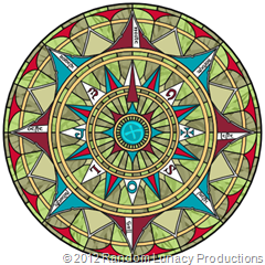
Here is the original concept art for this coin (and the series) as it was first shown to manufacturers:
I’ve placed the “back” or “compass” side first above, because that is the common design between all 4 coins, and the inspiration for the whole concept.
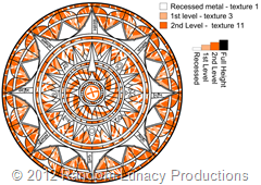
The complexity of the metal work we wanted was such that we did a ‘metal map’ version of the artwork to help ensure that there was no confusion.
From there, the Mint produced a first round of blueprints, and we went through several iterations (around 10) to get the metalwork blueprint to something we liked. This included a bit of negotiation and compromise as we learned what the limitations of manufacturing were for some of the detail. The final metalwork blueprint looked like:
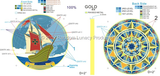
Now came the fun of deciding on metal and enamel color combinations to produce the different editions! We originally designed 6 of them, and had them sampled. After the samples came in, we ended up designing a 7th edition. The way we went about this is to take the metal blueprint above, and start doing color-fills to approximate what we expected it to look like. Here’s the initial color map for just the regular edition:
Again, we went through several iterations (and modifications) to get to:
You’ll note that the final version has a significantly smaller number of transparent colors, due to the transparents not being as stable during 'baking’, especially in fine details the more there are.
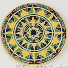
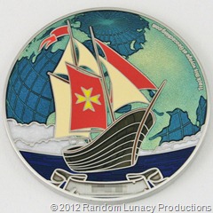
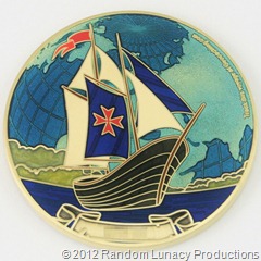
Finally, all editions were produced, and they look like this:
Warm Seas – Gold:
Warm Seas – Nickel:
Warm Seas – Antique Gold:
Warm Seas – Antique Silver:
Dawn – Antique Bronze:
Sunset – Copper (Artist Edition):
Midnight – Black Nickel (Artist Edition):
So, that’s the first coin in the Voyage of Exploration series. We had several other designs in the pipeline while we were working on this one, watch for those to show up here!









No comments:
Post a Comment